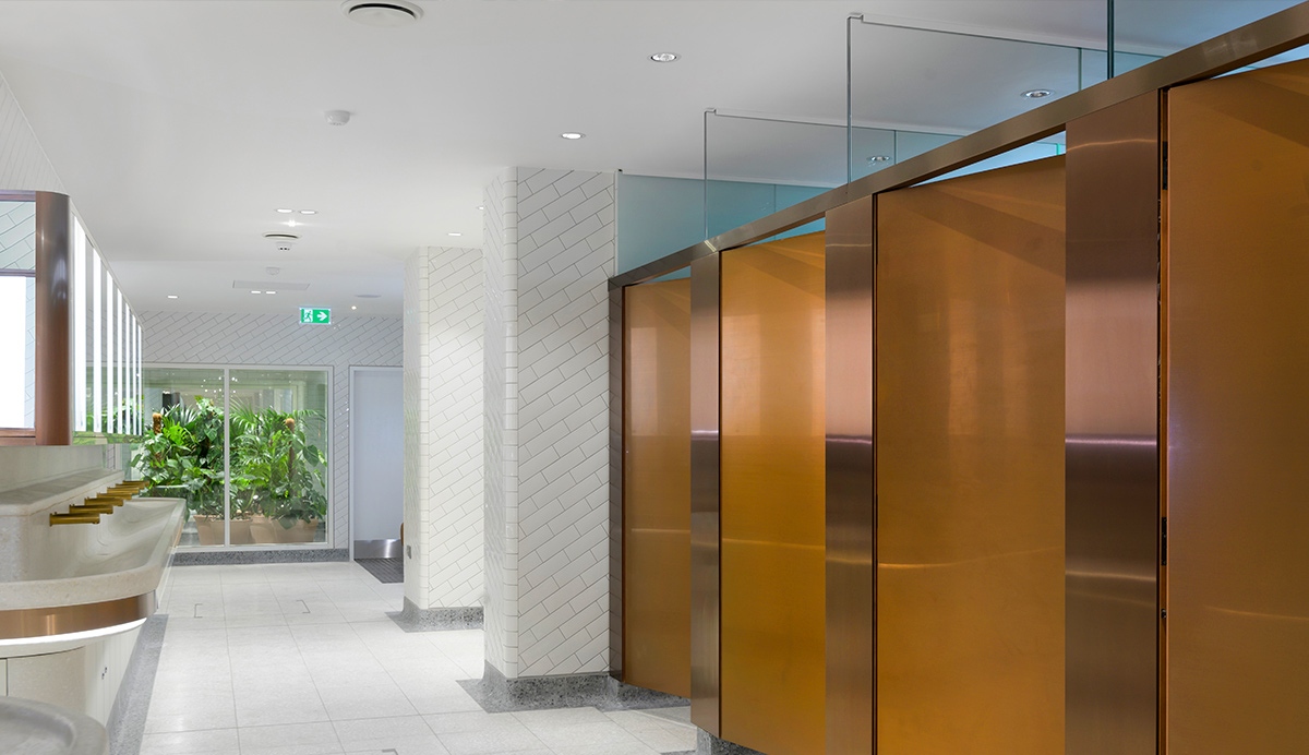
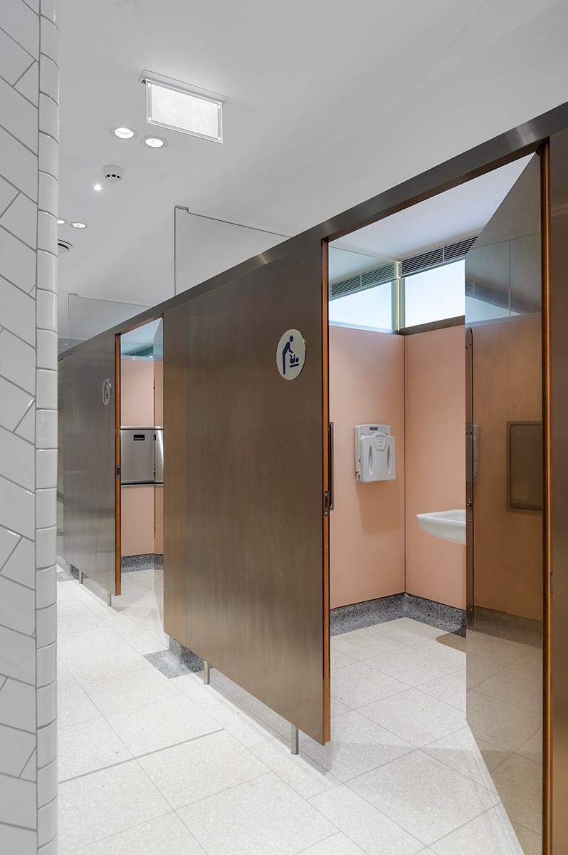
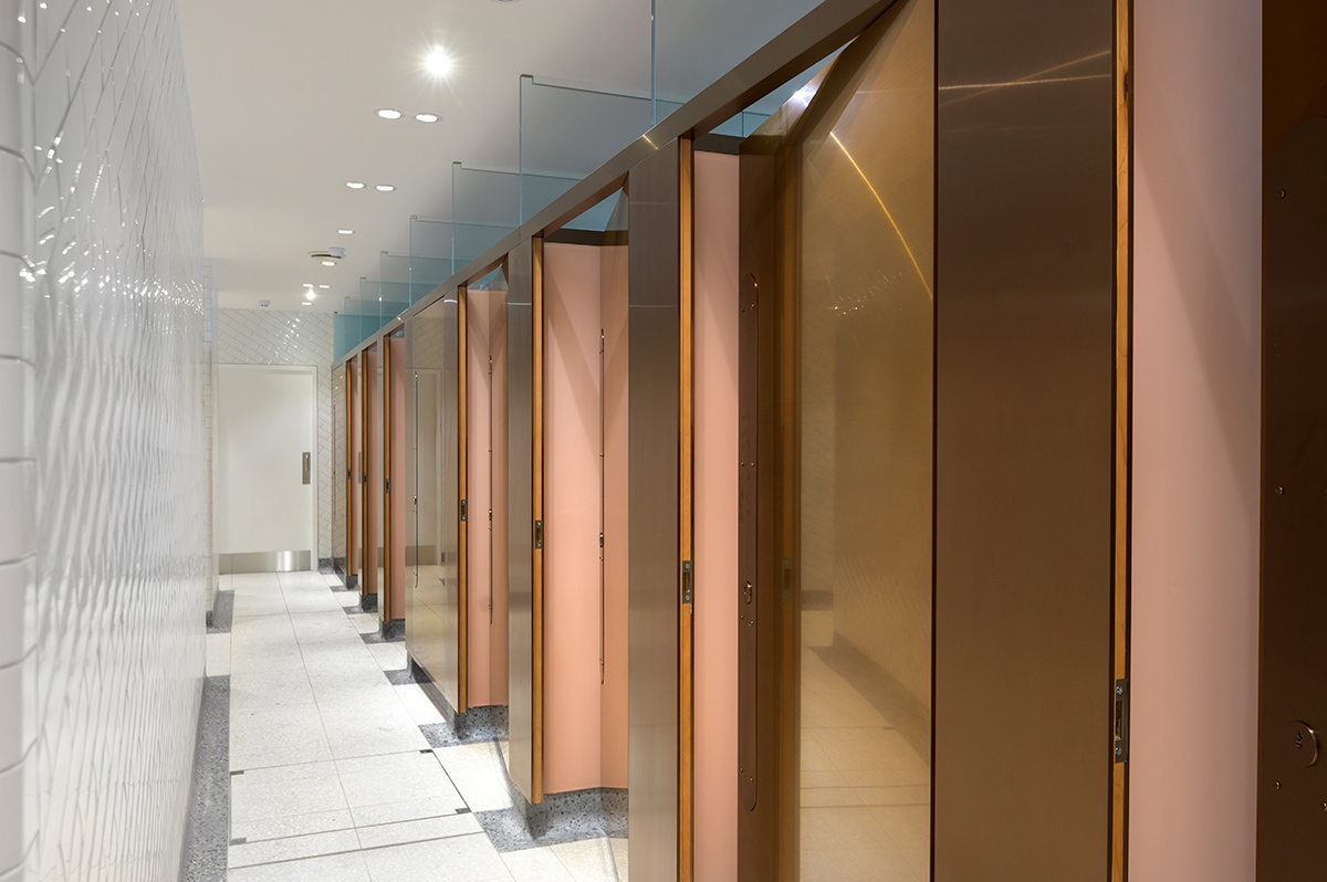
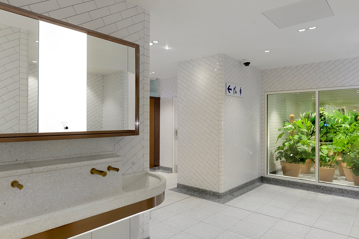
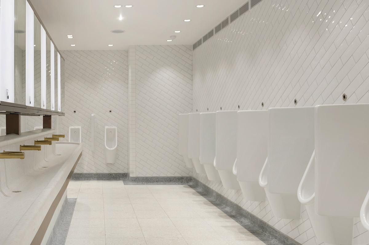
Interior of upgraded toilets at Victoria Station, London.
Showing contrast in cubicle door and surround achieved through turning the grain of the stainless steel 45 degrees. PVD coloured stainless steel in Rose Gold Hairline.
Client: Network Rail
Architects: Landolt + Brown
Fitout: Maxwood Washrooms
PVD coloured stainless steel by Double Stone Steel
Architectural metalwork by John Desmond Ltd
Not a standard WC brief

Adam Brown from Landolt + Brown tells us about his approach and involvement in the project.
I had worked with Network Rail since 1997 on different projects when I was part of McAslan and Partners which is also how I first met John Desmond Ltd.
In 2006 we set up Landolt + Brown and have worked directly and indirectly with Network Rail since then. Our first relationship with Osborne, who were the main contractor on this project, was working with them for Network Rail on Twickenham and Waterloo stations.
The Victoria WCs was a project that we would not normally take on as we would usually only design toilets if they were part of the whole station project. However this project was design-led and started with a very different sort of brief.
The brief
As Network Rail admitted to not being very good at monitoring non train-related areas of the stations they asked the Design Council’s CABE to write the brief. It turned out that the condition of the loos was rated as the second most important item.
We heard from the air industry that WCs were considered very important by travellers and were part of what really mattered. If the WCs were poor then feedback on peoples’ travel experience was resoundingly negative and was profoundly positive when the loos were good.
This meant upping the architectural design quality and throughout the Network Rail organisation, from the Chairman to the CEO, this raised interest. Instead of being like a big project such as Kings Cross or London Bridge with only thin architectural content it represented a significant change in direction.
Creating our own detailed brief
The brief from CABE was very open. We took as inspiration from places such as Rothsay Hotel on the Isle of Bute and the Savoy Hotel, very much drawing from the Edwardian era where gents’ urinals used terrazzo and marble. We didn’t want to produce something glitzy and skin-deep like a shopping mall but something that reflected the strong attention given to fabrication and build. We used the themes from the hotels to weave a softer thread into the design.
For inspiration on materials used we looked at historic precedents such as railway architecture in the 1930s and also the Edwardian period especially the London Underground during that time which was built to last “forever”. Charles Holden (1875 – 1960), the designer responsible for the creation of many London Underground stations, is the inspirational modernist whom we always had in mind.
The client did not know what they wanted so we suggested that we took some time to go away and come up with an idea of how the interior needed to be. There were very limited timescales and we pointed out to the client that if they didn’t like it there was no time to change it and they accepted that. We all agreed however that the project results had to be perceived as World Class.
There are two very clear objectives for us in our projects:-
- That it will last 50 years
- That it is robust during that time
We also remembered that we were creating a contemporary interior and although we reference back to other eras this is a modern space.
Durability
The visitor numbers have gone up again since the turnstiles were removed and entry is free so anyone can come in to use the WCs, and we needed to be mindful that this would include people from hostels and drug dealers who may intend to use the facility differently. So you will see why durability was going to be of top importance.
Shapes, curves, lines and durability, people flow
In the Victoria WCs we created curved corners to the walls which make the corners very tough. This was crucial as the station WCs receive 200,000 visitors per day, so very high volumes of people. The alternative when having square corners is to apply protective metal corners which would not be very stylish or practical. Curved corners allow for how people move about, they avoid banged hips and shoulders and allow large numbers of people to flow around the space.
The bricks were set at the same gradient as the stair diagonal as we wanted to keep a visual connection with the descent and elevation and an idea of the level above which is bright and airy. The bricks on the corner were reversed again to flip the geometry the other way and have a bit of fun.
Descending down into a basement is counterintuitive so we felt using the linear angle was a help both in descending and re-ascending.
Expanding a compressed space
The basement was a very dark and dingy compressed space so to counteract any claustrophobic feel the ceiling heights were pushed to the absolute maximum limit. To make the space as un-oppressive as possible we used a pale palette. Conversations and agreement had to be had in order to use these colours as the maintenance would need to be of a rigorous and frequent nature. This was understood and agreed.
Security, privacy and cleaning
The design of the cubicles brings out two opposing objectives.
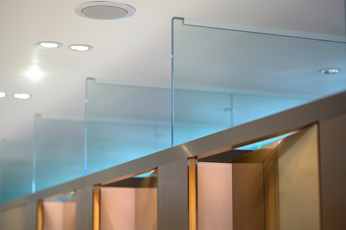
Firstly, security is of enormous importance and if the cubicle partitions are off the ground this enables visibility so that any irregular or illegal activity can be easily detected.
However, the need for security would determine a design which is in direct opposition to that in which dignity was paramount. Sharing this space with others is not dignified and enlightened designers and owners of communal space are increasingly creating lavatory space that comprise private cubicles.
So the internal cubicle partitions are run completely down to the ground as walls as this is the route to a dignified space.
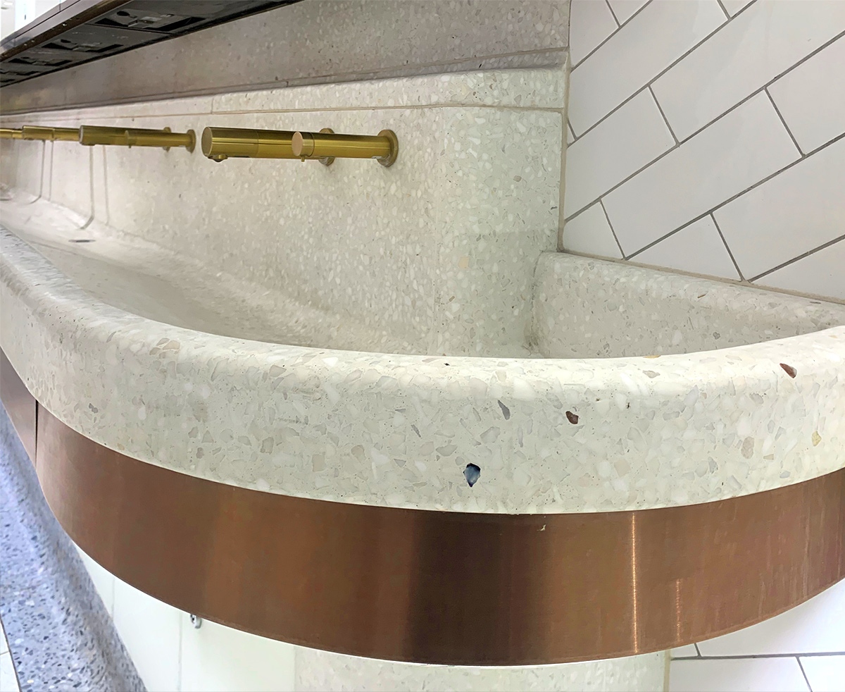
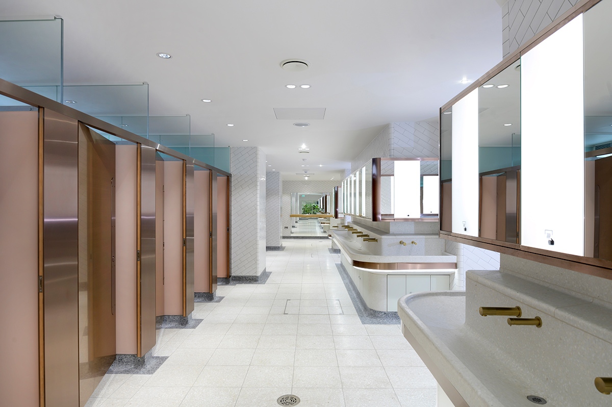
Giving up raised cubicle partitioning could have meant also giving up ease of cleaning. We knew we couldn’t have rectilinear junctions so curved skirting sections were necessary. These are made of terrazzo with a large radius and are deeply set into the floor – remembering we want them to be there in fifty years’ time. They were tricky to fabricate and very expensive but allow ease of cleaning as there are no joins in which grime can collect.
Solidity in fabrication
The wall tiles are in fact bricks, again as those that are used in the Underground tunnels. They are 18mm thick as opposed to a standard slip tile which is only 6mm thick.
Yes, they are a very glossy finish – we were happy with that but the truth is we didn’t have a lot of choice due to the short lead-times. We knew we wanted a solid-looking brick with a visual integrity – not something that looked as though it had just been stuck on – and there wasn’t a huge range to select from in the timeframe so we went with the white. So basically to source and specify these tiles our initial question was “What can we get that has a radius corner?” and then we selected from the range available.
The bricks are very strong and it would take a great deal of force to crack or chip one of these tiles as opposed to a standard house tile. We used them on all of the walls. This specification was in line with our approach which is to create environments that are from integrated materials and architectural rather than cosmetically applied, here it meant using mortar rather than grout.
Engineering, metalwork and John Desmond Ltd
I have great empathy for metalwork and engineering skills as my father was a metal fabricator making lighting fittings. I first met Rodney Welham from John Desmond Ltd in 1995 when we refurbished the Great Room at the Royal Society of Arts, I was with McAslan at the time. I got on well with Rodney and enjoyed working with him– I felt we could get out pencil and paper and work things out.
So, when we were offered the Victoria Station project, I turned to Rodney for help and not a conventional cubicle manufacturer. Rodney wasn’t able to take the lead in the project but suggested Maxwood Washrooms, who were simultaneously proposed by the main contractor Osborne.
Maxwood took over the taps and plumbing and intricate side of the work – we worked well with them. They took the lead on the glass and some less visual items such as the metalwork framing behind the cubicles
The architectural metalwork was fabricated by John Desmond Ltd and managed by April Dahlberg and Rodney who liaised with us all.
Craig Greenway, the Maxwood technical manager was very practical and as I am very interested in how everything is put together we made a good team. I am of the view that if an architect understands how it all goes together you end up with a much better product rather than handing over a design and standing back and demanding it be fulfilled regardless of method even if it is impossible to build. I like to work with the guys who know how to cut a metal bolt as they are the ones that can educate me on how it is going to function and what it will look like.
Contact April Dahlberg about your project
Bronze, copper and introducing Double Stone Steel PVD coloured stainless steel
I had heard of PVD but had never used it before, we had talked about in reference to taps, ironmongery and hardware. Then we looked at it with reference to some trims and panels so exploring different applications. I had not researched it much then this project came up and the chance to use a product with a strong warranty, also I trust John Desmond Ltd and knew they wouldn’t put in something that didn’t work.
We were aiming to continue the 1930s thread drawn from the design of railway arches and planned to use copper and bronze such as the handrails and stair-nosings and bands running around that you see still used in those locations.
There is a long tradition of modernists using bronze and we would have liked to use it but there were two main drawbacks:-
- The cost – it would be very expensive
- The instability of the appearance. Although I like the patination that develops, for example on handrails where they are part rubbed and part untouched, this is not the effect we were looking for and also it would be somewhat unpredictable and might end up looking strange. In wet areas too it can develop a verdigris.
All in all we concluded that using bronze was too risky so the decision was to use PVD which we hadn’t planned to use to this extent. We had to go through a similar decision process when it came to the copper that we wanted. If we had used copper sheet for the cubicle doors, as it is soft it would have dented easily, yes we could have laminated it but it still would have tarnished and also been expensive whereas PVD we knew would be a stable finish.
OK so it is not genuine copper and I do like using genuine materials, but it will be durable and stable and it was the best way to towards the copper/bronze palette that we wanted and will stay looking the way we wanted! The actual colour name in PVD is Rose Gold however it is the copper colour that we aimed for.
Order a sample of Rose Gold Hairline PVD coloured stainless steel
Order a sample of Bronze Brushed PVD coloured stainless steel
PVD grain colorations and finish
We experimented with the grit levels to get the steel finish we needed. We had a problem with the door panels as they were too big for a single sheet of PVD coloured stainless steel in the direction of grain that we wanted. We wanted the grain to run horizontally and not vertically. The reasons for this are that the colour appears differently when running vertically. It is darker and with fewer of the warm copper tones. But to run the sheet horizontally meant the sheets were not big enough for the cubicle panels as the standard is that the grain runs along the longer dimensions of the sheet. We also wanted a rougher finish. So for the door fronts only April sourced a manufacturer in Germany who could grind the bigger sheets which could then be cut so as to run the grain horizontally. This used a heavier grit. For the rear of the door panels we used the standard grain which is vertical and John Desmond Ltd fabricated these themselves. The reason for this was that we didn’t want too much exposure to risk on the project, considering the timescales and also importing the material was expensive with a longer lead time, we didn’t want to be held up by that. By using the off-the-shelf product for the door rears meant we could move quickly.
See range of finishes for PVD coloured stainless steel
See range of colours for PVD coloured stainless steel
Adding a courtyard and bringing in fresh air
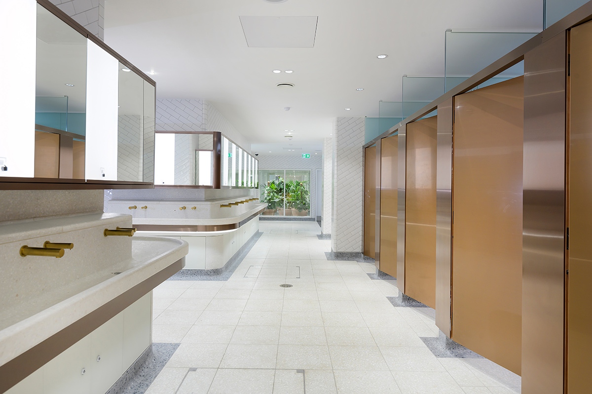
Network Rail took a brave decision in having a greenhouse in this basement area which was entirely artificially lit. There may be other greenhouses out there like this but we had never heard of it. The greenhouse gives the space a courtyard feel and not one of being in a basement.
Addressing air-flow and purifying the air was essential and the plants were a contributing factor so real plants were necessary and plastic would have been horrible anyway. Plants give an amazing feel-good factor and being so unusual here it is a real “wow” for people.
Being lit only artificially we were very nervous about the success of the greenhouse. However the plant experts were used to developers who have deep floor-plates but want greenery in the middle. They used special light fittings which have the correct light frequencies and a very high output, as daylight is many times brighter than any artificial light source.
Before our refurb the air-quality was terrible, it used to build up a real stink down there. Now you would not know you were in a WC the air quality is so good. This is because 50% of of the work done is not visible to the eye but behind the scenes, here it is creating air flow through clever engineering.
A calming palette
We chose back-painted glass to line the cubicles, this has a satin finish and feels thick with a frosted quality that gives depth. It is a pale peachy pink for both the men’s and women’s WCs so gender-neutral.
This has a psychological impact It is calming and helps to counteract antisocial behaviour hence being used in hospitals and prisons. Researchers at a Base Station in the Antarctic where personnel have to camp for lengthy periods of time found that this colour was calming to mood.
Provision for disabled people
There was a very strong push for diversity and inclusion within the design.
The disabled WC is outstanding, includes changing places and is gender-neutral. It has a large turning space plus a hoist and a changing table. We were sceptical as to how many people would use it but we have received many thanks for it from grateful people. Even the dyed-in-the-wool engineers were open-minded on this and all for it. The feedback forms receive 2000 comments per day but there have been no grumbles even though the disabled WC takes up so much space.
Anti drug-use and security
Cubicles were designed so that there was absolute minimum opportunity to stash drugs or needles, syringes or knives. As far as possible to be seamless and smooth was the objective for all surfaces. There are no access panels just one or two inspection covers to keep the surface as uninterrupted as possible. There are no ledges within the cubicles, anything that would have been a ledge is Toblerone in shape so it cannot be used as a ledge. All ventilation is at high level.
For maximum security the WCs would have been designed in a completely utilitarian way which would have created a very institutional environment. However our priority was how they made people feel and for them to have a positive reaction to how they are being treated. This created a conflict. For example we needed to place bins in the disabled WC but the security personnel asked us to remove these as they were not visible and bombs could be placed in them.
A result with the Wow factor
Craig Greenway of Maxwood Washrooms tells us what it was like working on the Victoria WC project.
It was all very challenging and stressful but at the end I looked at the job and thought “wow” and over all the thousands of jobs I have completed there are only a handful of projects where I have thought that. Can you believe that when we recently visited the site in our hi-viz jackets, people came up to us to ask if we had been involved in the project and to thank us and to comment on how fantastic the loos were? We understood that people were “holding on” in order to use these toilets in preference to others on their route.
Intense communications
All the teams worked together amazingly well and the vision was got across very effectively. André Barros at John Desmond Ltd did a fantastic job interpreting what was needed, sending back ideas and cross-checking. The level of communication was unusual in that it was of a very high standard and the result is spectacular. A lot of hours were worked alongside Adam Brown and the team leader, Abe Gordon, and also transferring information to Double Stone Steel.
April Dahlberg at Double Stone Steel made a lot of really insightful suggestions that saved us budget. She could see what we were aiming to achieve and suggested different, more economical ways that were feasible to fabricate. Double Stone Steel gave us a lot of guidance and support.
We at Maxwood specialise in unique projects and work to very high standards, we like to think we are the ultimate washroom supplier. It is not often that working on these architectural projects is so rewarding. We worked late at night many times to get the detailing right. Taking the concept through to the actualisation – this what our team did by working together so closely.
Contact Matt, Estimating & Production Manager about your project
Bespoke and premodelled items
Everything was made bespoke, the glass for the mirrors was made in the Netherlands. The vanity tops’ structural metalwork was made elsewhere and of course then there was the PVD, all fabricated from drawings. Our objectives were to get all the deliveries on time and on budget and everything was pre-modelled and was to be put together on site. Everything had to be manufactured before our time-slot on site so accuracy was critical. Although the putting-together on site was a harrowing process it all worked. The press and the public knew the toilets were being upgraded and were waiting to hear of our failures – but there weren’t any!
We only had two or three months on site. I had worked with John Desmond Ltd previously – there are not many people as skilled as they are in architectural metalwork so they were the obvious choice. They are very experienced and manufacture what they are asked to do to a high quality.
The cladding they made to fit the doors was perfect to the millimetre, if it hadn’t been then there would have been a gap but it was cut and folded to suit and fitted perfectly.
The angles on the vanity tops were curved and rolled and had to fit the terrazzo tiling – the steelwork, made elsewhere, fitted perfectly and the PVD curved trim fitted into it exactly. The accuracy was unparalleled. This was why it was so stressful, if one element had been wrong the whole fitment would have failed.
We wanted to use PVD as it retains its lustre so we didn’t need to worry about it changing its appearance, it will always look good.
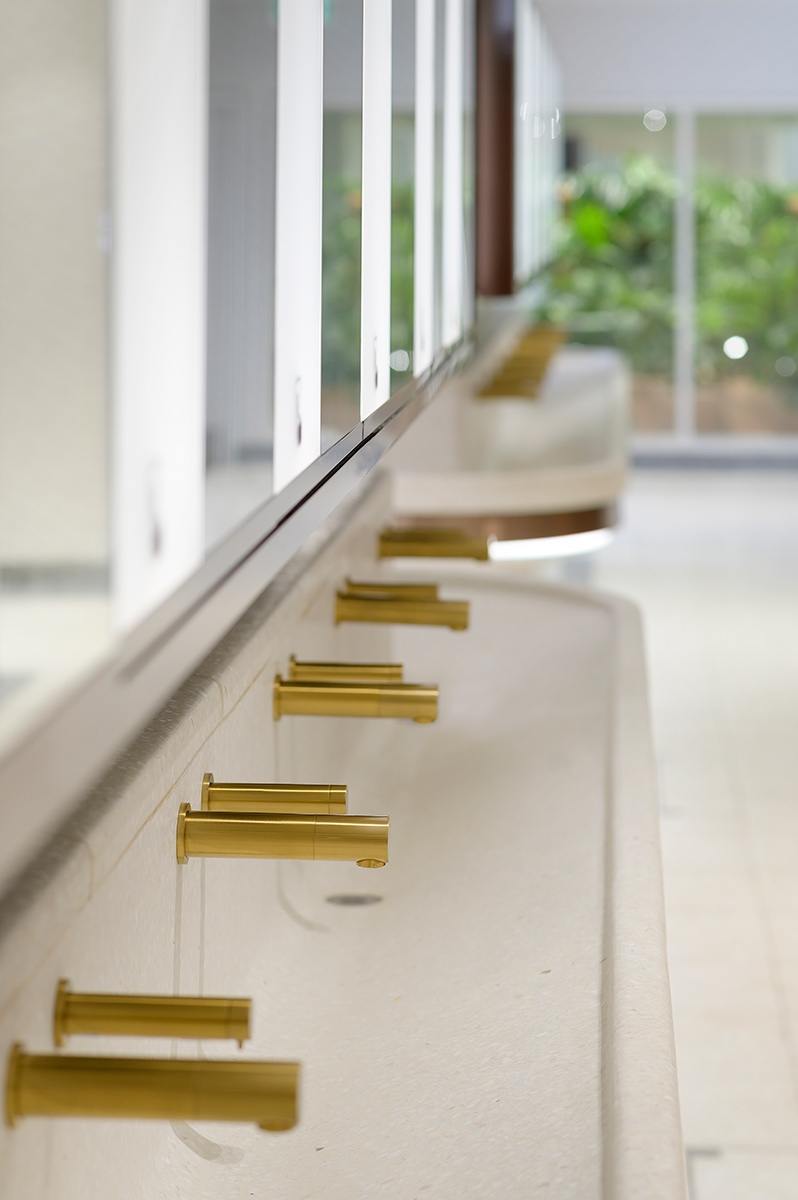
Communal basin with curved perimeter and taps in PVD coloured stainless steel Bronze No 4 Brushed finish.
Project: WCs upgrade, Victoria Station, London Client: Network Rail
Architects: Landolt + Brown
Fitout: Maxwood Washrooms
PVD coloured stainless steel by Double Stone Steel Architectural metalwork by John Desmond Ltd
Communal basin with curved perimeter and horizontal banding in PVD coloured stainless steel Bronze No 4 Brushed finish to match taps.
Client: Network Rail
Architects: Landolt + Brown
Fitout: Maxwood Washrooms
PVD coloured stainless steel by Double Stone Steel
Architectural metalwork by John Desmond Ltd
Client: Network Rail
Architects: Landolt + Brown
Fitout: Maxwood Washrooms
PVD coloured stainless steel by Double Stone Steel
Architectural metalwork by John Desmond Ltd
Toilet cubicles with calming colour palette interior, down-to-the- floor partition and PVD coloured stainless steel doors in Rose Gold Hairline.
Project: WCs upgrade, Victoria Station, London Client: Network Rail
Architects: Landolt + Brown
Fitout: Maxwood Washrooms
PVD coloured stainless steel by Double Stone Steel Architectural metalwork by John Desmond Ltd
Interior of upgraded WCs Victoria Station, London with 18 mm thick glossy white brick and curved terrazzo skirting for ease of cleaning.
Client: Network Rail
Architects: Landolt + Brown
Fitout: Maxwood Washrooms
PVD coloured stainless steel by Double Stone Steel Architectural metalwork by John Desmond Ltd
Visual for upgrade of WCs Victoria Station, London showing white, bronze and copper colour palette with indoor courtyard shown at the far end.
Client: Network Rail
Architects: Landolt + Brown
Fitout: Maxwood Washrooms
PVD coloured stainless steel by Double Stone Steel
Architectural metalwork by John Desmond Ltd
Visual for upgrade of WCs Victoria Station, London showing bronze PVD stainless steel taps and horizontal banding around communal basin.
Client: Network Rail
Architects: Landolt + Brown
Fitout: Maxwood Washrooms
PVD coloured stainless steel by Double Stone Steel Architectural metalwork by John Desmond Ltd
Interior of upgraded WCs Victoria Station, London showing bronze PVD stainless steel taps with matching mirror frame and horizontal banding around communal basin.
Client: Network Rail
Architects: Landolt + Brown
Fitout: Maxwood Washrooms
PVD coloured stainless steel by Double Stone Steel Architectural metalwork by John Desmond Ltd
